Most entrepreneurs think success is earned by doing more: longer hours, faster work, endless grind. They assume that if their brand looks polished, their content is consistent, or their messaging is clever, the audience will naturally follow.
The truth? Your audience doesn’t just respond to what you show — they respond to how you show up.
Entrepreneur Meal Plan isn’t just a program. It’s a reminder that self-care, rhythm, and intentional support aren’t optional — they’re the foundation for sustainable impact, influence, and legacy.
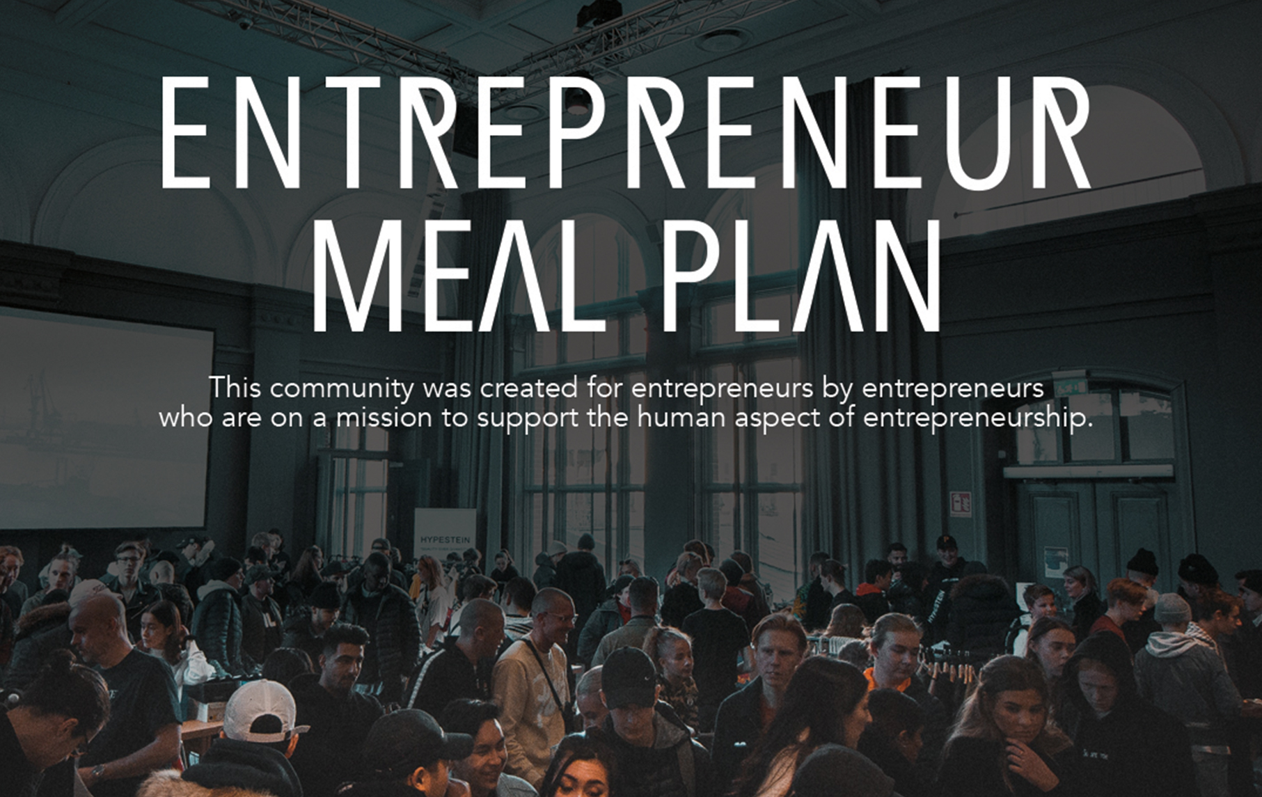
Our goal wasn’t just to refresh a logo or colors. It was to make the EMP brand feel like the sanctuary it promises: a space where entrepreneurs can pause, regroup, and thrive — and invite their audience into that same experience.
Project Overview:
Client: Entrepreneur Meal Plan (EMP)
Industry: Plant-Based Wellness / Entrepreneur Self-Care
Founder: Entrepreneur wellness leaders
Core Problem: Brand misalignment + crowded, competitive wellness market
Oathic Focus: Brand clarity → story-led visual identity → tribe-centered positioning
Deliverables: Brand audit, visual identity redesign, logomark & wordmark, brand patterns, campaign assets, brand guidelines
Timeline: Comprehensive redesign with full team alignment
The Challenge
Surface symptom:
“We need a refreshed look to better reflect our mission and resonate with our audience.”
Root issue:
EMP’s core value of self-care and community-driven wellness wasn’t fully expressed visually or strategically. The brand identity lacked cohesion and didn’t fully differentiate EMP in a saturated plant-based wellness and entrepreneur audience space.
Risk if unchanged:
Without a deeper alignment, EMP risked appearing as just another wellness program—its mission, influence, and community impact were diluted, leaving both current and potential members disconnected from the experience it offered.
EMP’s core value of self-care and community-driven wellness wasn’t fully expressed visually or strategically. The brand identity lacked cohesion and didn’t fully differentiate EMP in a saturated plant-based wellness and entrepreneur audience space.
Without a deeper alignment, EMP risked appearing as just another wellness program—its mission, influence, and community impact were diluted, leaving both current and potential members disconnected from the experience it offered.
Strategic Insight
The opportunity was clear: EMP wasn’t just a wellness program — it was a movement, a tribe, a framework for self-care and sustainable entrepreneurship.
Visual identity needed to reflect:
• Community, mentorship, and shared purpose
• Ritual, grounding, and continuity (self-care as a practice, not a trend)
• Legacy and timelessness — the idea that EMP creates generational impact
The insight became the guiding principle: design should make the tribe and its values visible, not just decorate a program. Every touchpoint needed to communicate belonging, growth, and long-term influence.
• Ritual, grounding, and continuity (self-care as a practice, not a trend)
• Legacy and timelessness — the idea that EMP creates generational impact
The Approach
Oathic’s process focused on uncovering the deeper narrative behind EMP:
Discovery & Alignment Sessions – Collaborating closely with the EMP founders to understand their audience, mission, and the legacy they wanted to leave.
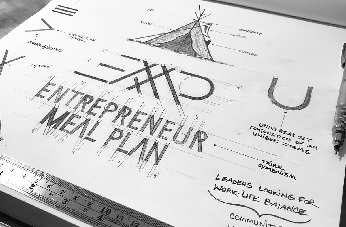
Cultural & Historical Exploration – Drawing inspiration from native tribes, communal structures, and traditional principles of support, mentorship, and growth to inform visual storytelling.
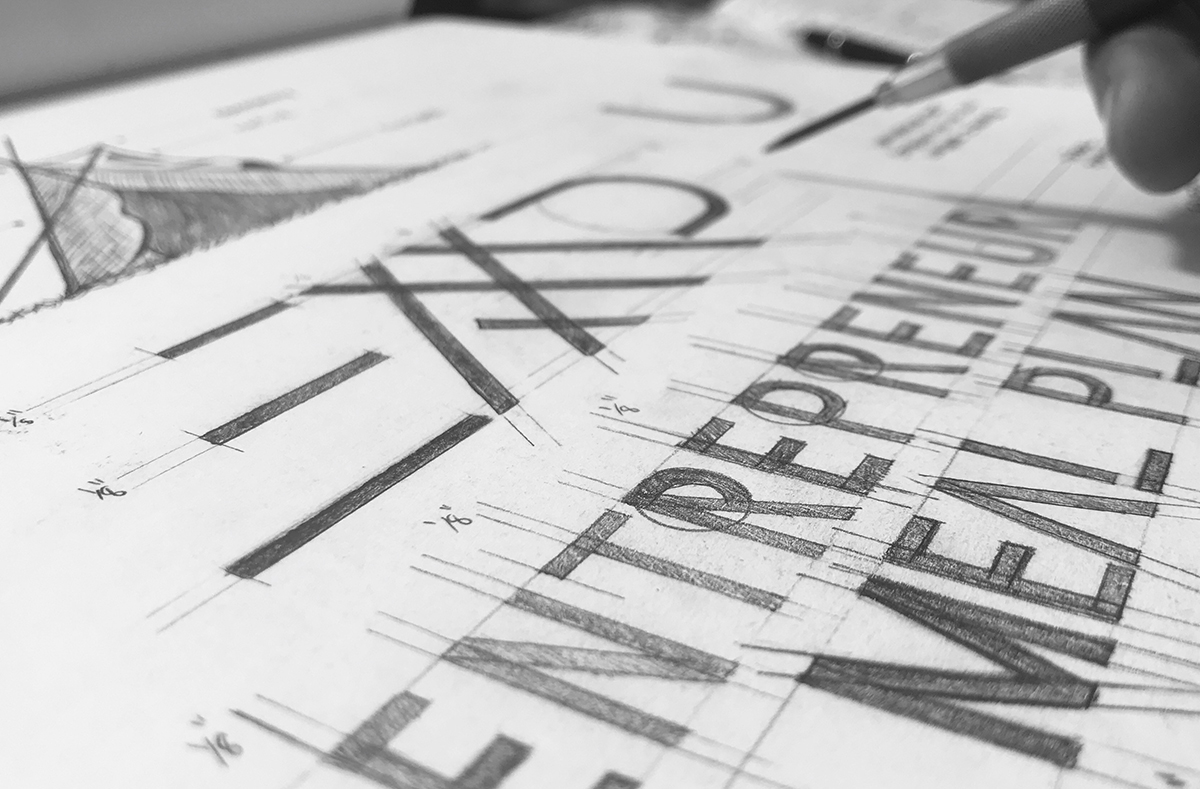
Concept Development – Translating insights into sketches, abstract motifs, and visual narratives that honored the essence of community and wellness.
Visual System Iteration – Testing multiple logomark and identity approaches to ensure cohesion, scalability, and emotional resonance with the audience.
This process prioritized clarity, connection, and authenticity over surface-level aesthetics.
The Solution
Every design decision was intentional and narrative-driven:
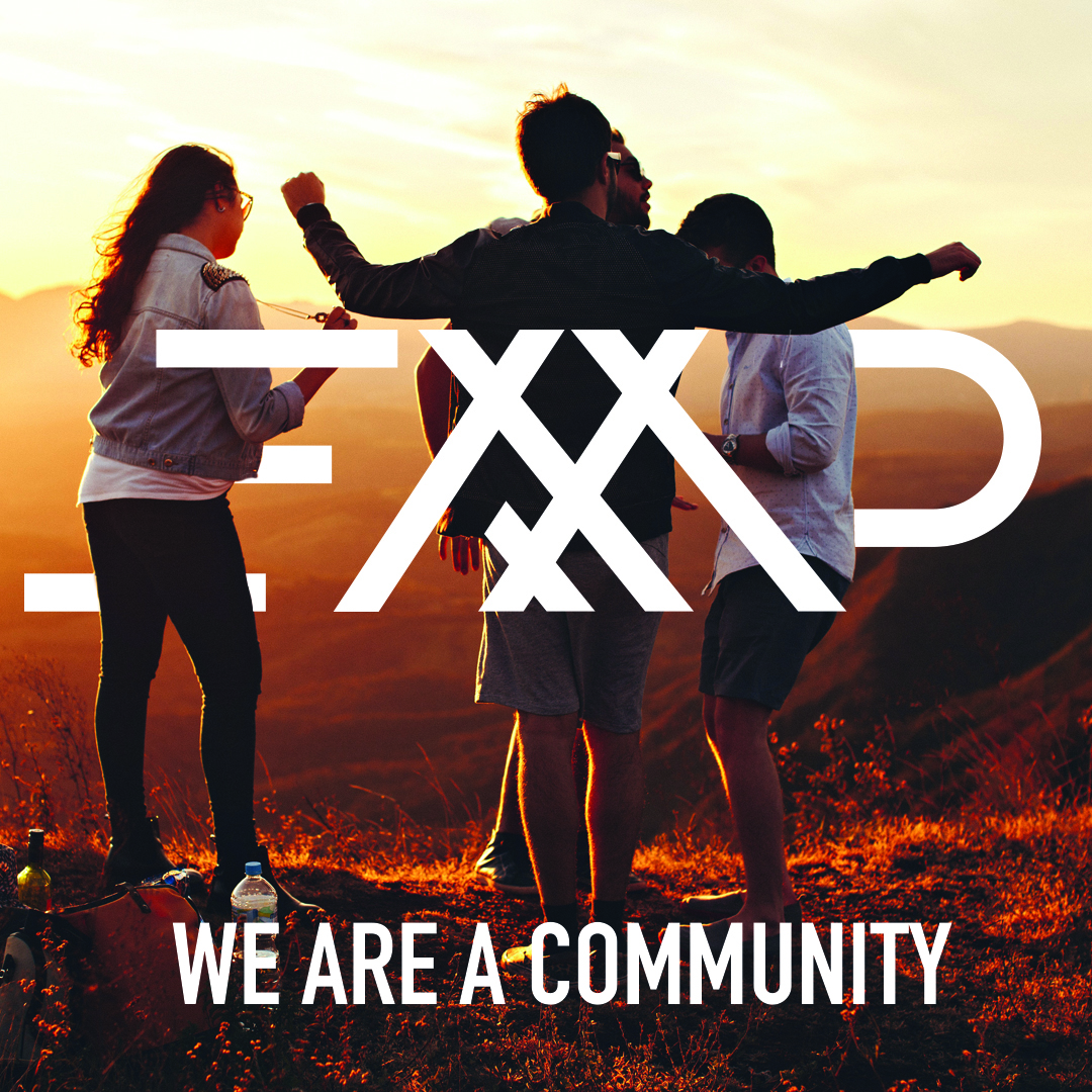
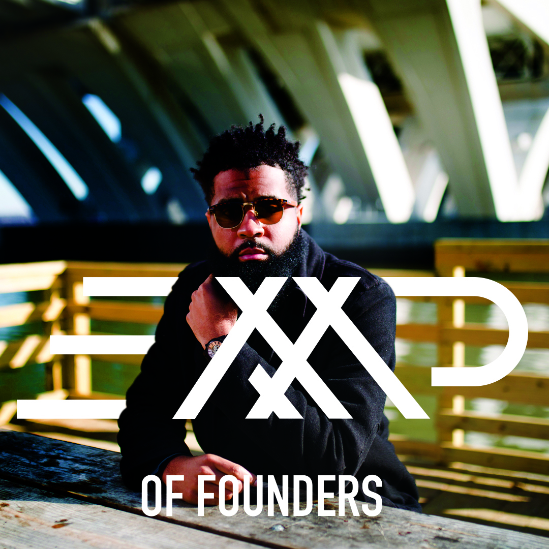
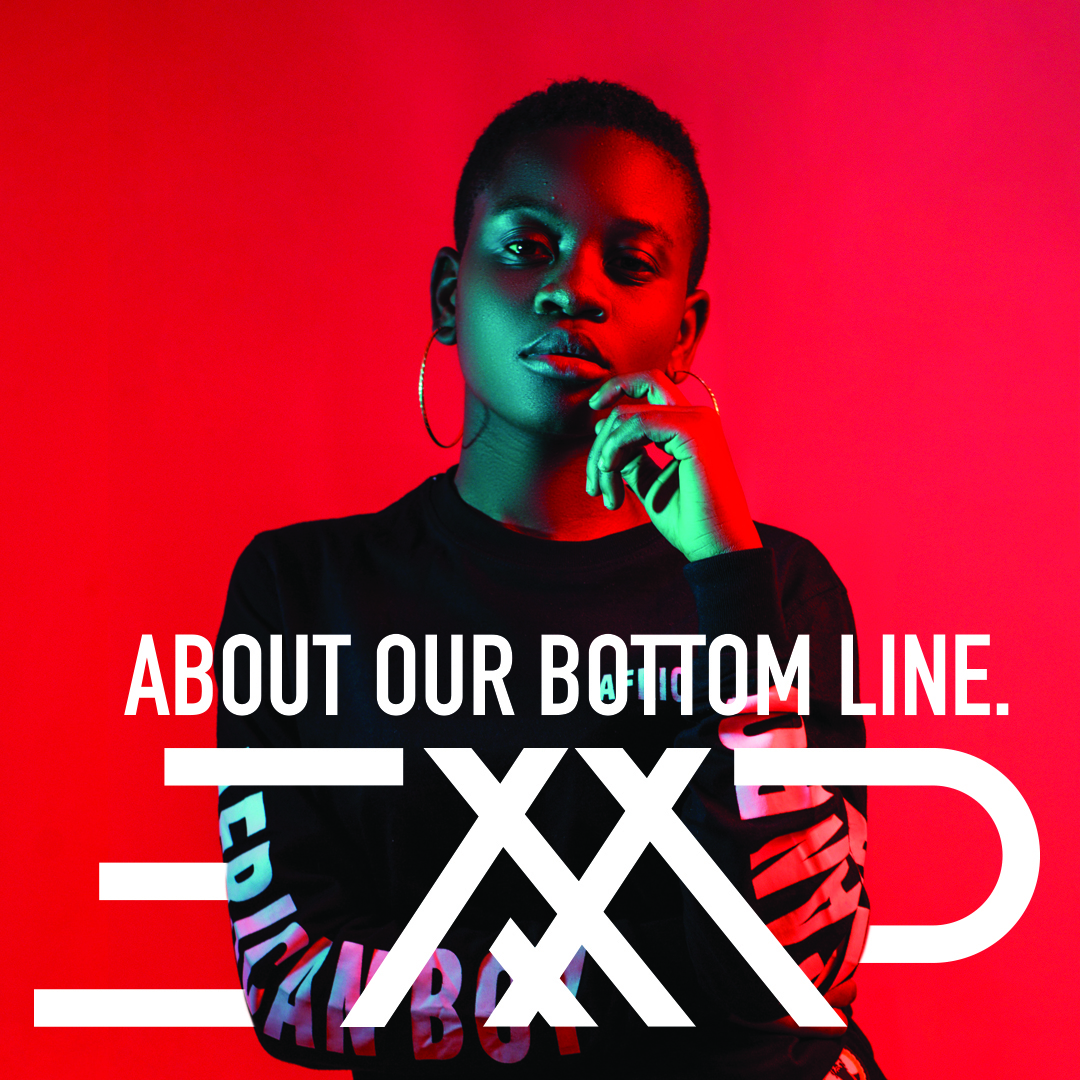
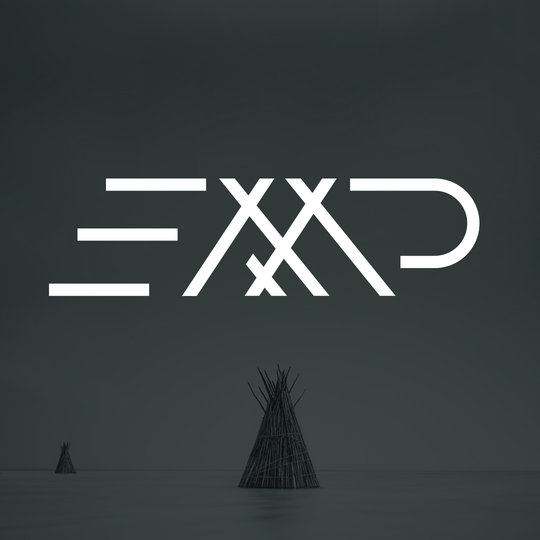
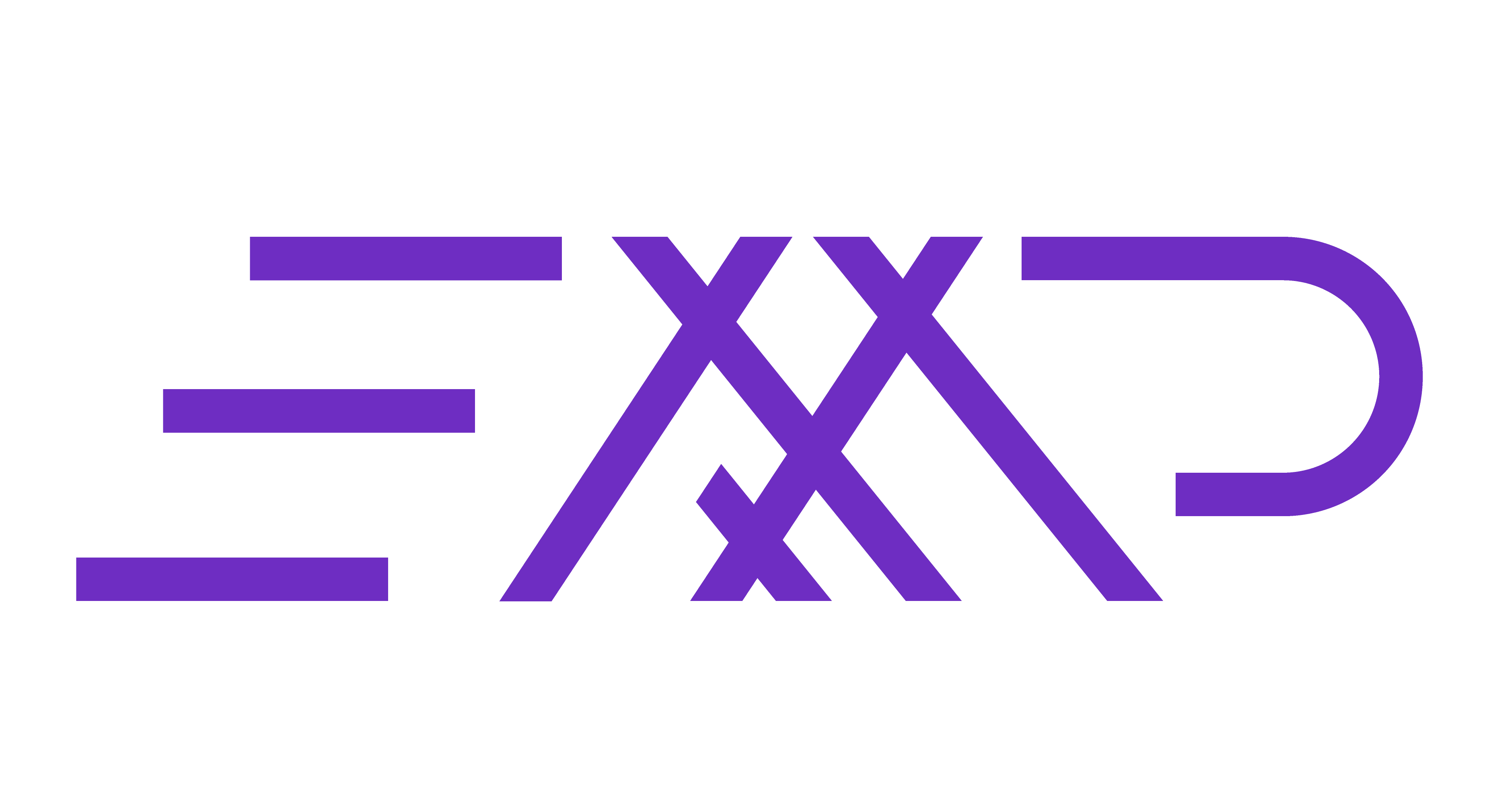
Abstract Logomark (Tribal Hut) – Represents early forms of shelter and community gathering. Vertical stems symbolize structural support, reflecting EMP’s mission to build strong foundations for entrepreneurs’ self-care and success.
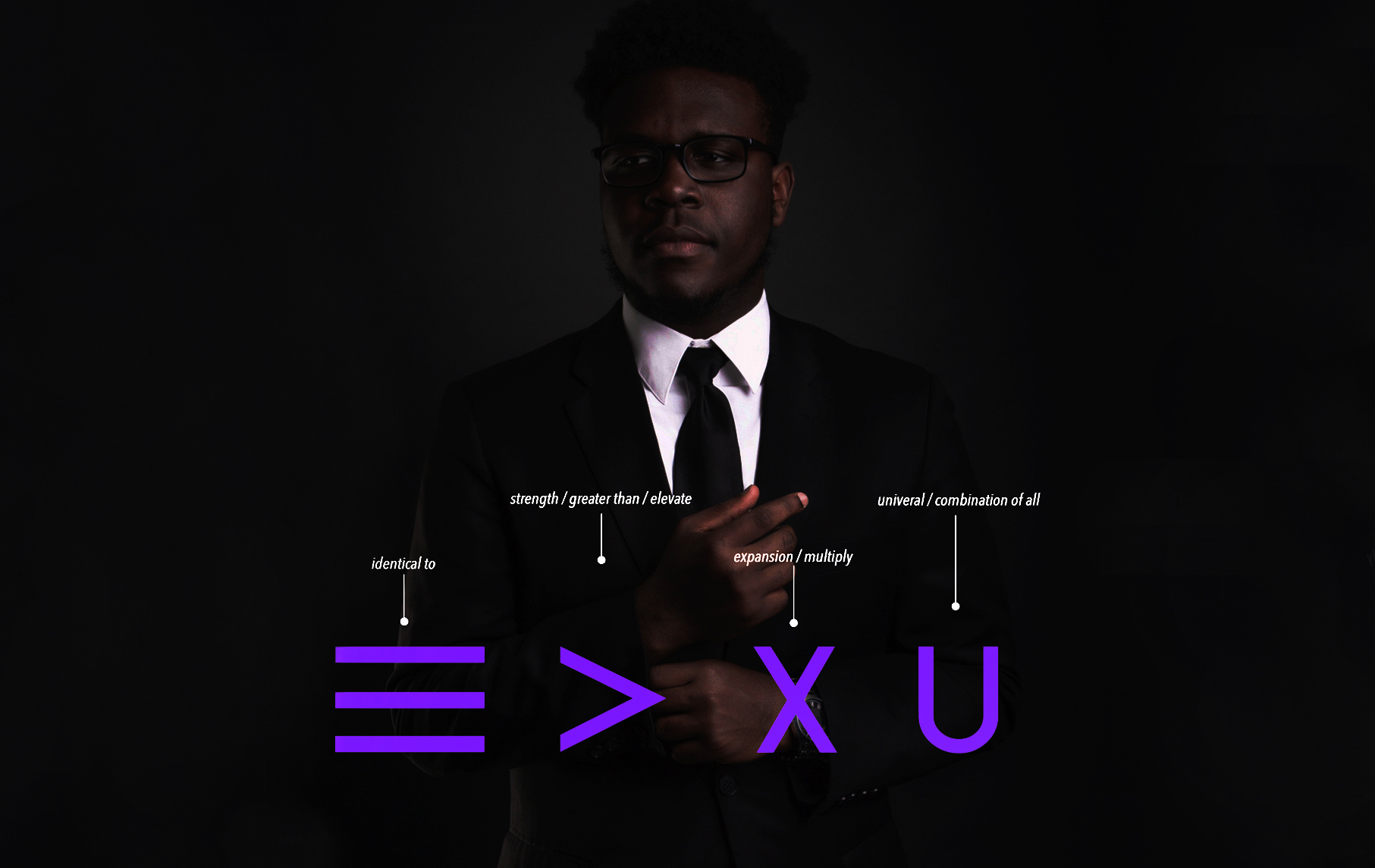
Custom Logotype<s/trong> – Derived from the logomark’s structural elements, giving the identity a tribal, timeless aesthetic while maintaining modern readability and brand flexibility.
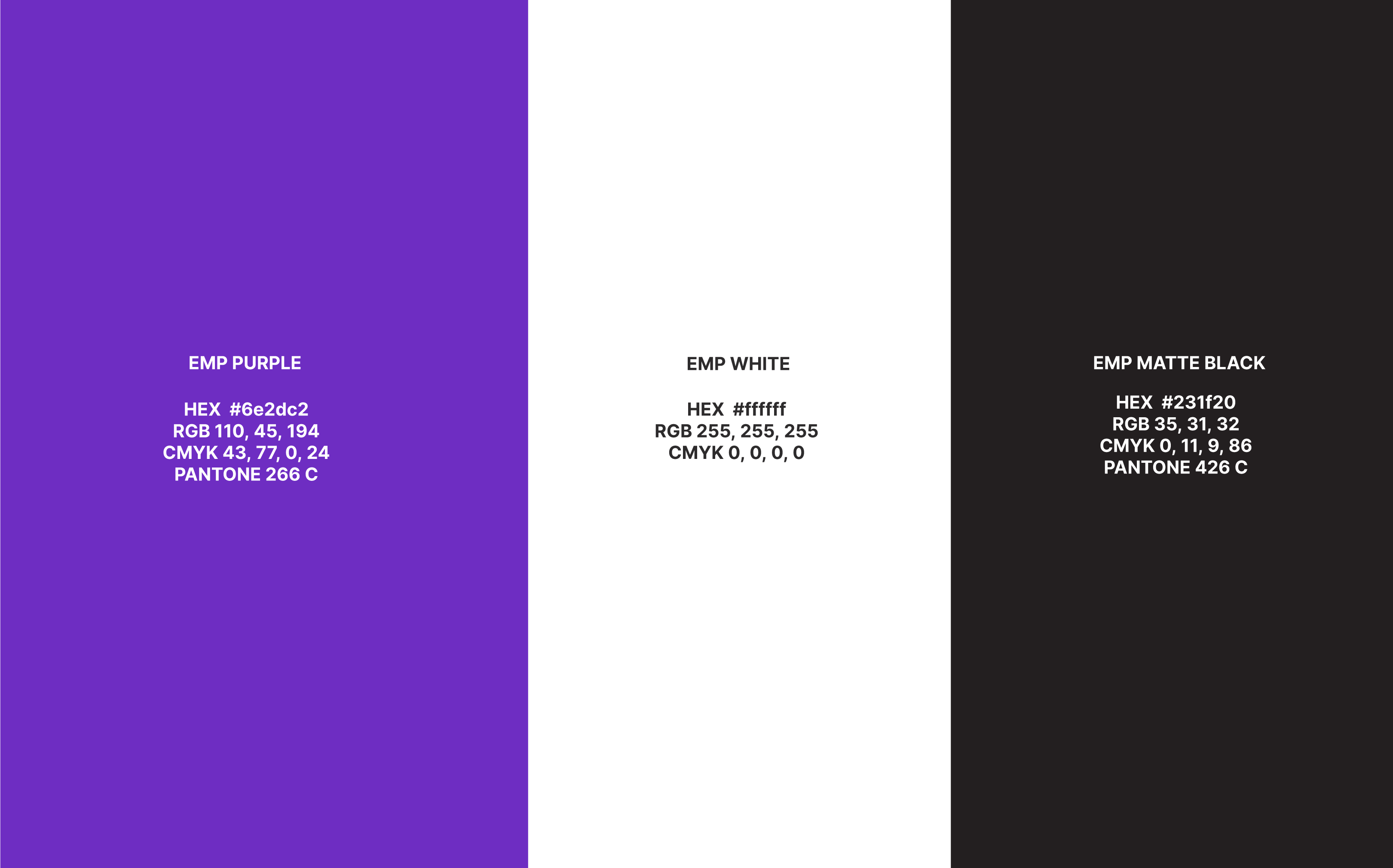
Color Palette & Patterns<s/trong> – Chosen to evoke warmth, trust, and belonging, reinforcing the sense of a supportive, safe space for the EMP community.
Visual System<s/trong> – Designed to scale across program materials, digital campaigns, and social media, creating a consistent and recognizable experience.
Together, these elements communicate EMP’s essence: a community-centered, supportive, and legacy-driven platform where entrepreneurs thrive through self-care and connection.
The Outcome
The Oathic-designed identity delivered measurable and qualitative impact:
The Oathic-designed identity empowered EMP to:
✅ Present a cohesive, visually compelling brand that clearly communicates its mission of self-care and community
✅ Build trust and recognition in a crowded plant-based wellness and entrepreneur market
✅ Reduce internal decision fatigue by giving founders a clear, repeatable visual system
✅ Convey the transformational experience EMP offers — from founder well-being to broader entrepreneurial impact
✅ Greater engagement with digital content and campaigns
✅ Increased member perception of professionalism and trustworthiness
✅ Strengthened brand loyalty and sense of community among program participants
✅ Build trust and recognition in a crowded plant-based wellness and entrepreneur market
✅ Reduce internal decision fatigue by giving founders a clear, repeatable visual system
✅ Convey the transformational experience EMP offers — from founder well-being to broader entrepreneurial impact
✅ Greater engagement with digital content and campaigns
✅ Increased member perception of professionalism and trustworthiness
✅ Strengthened brand loyalty and sense of community among program participants
Brand Expressions Brought to Life
The EMP visual identity comes alive across multiple touchpoints:
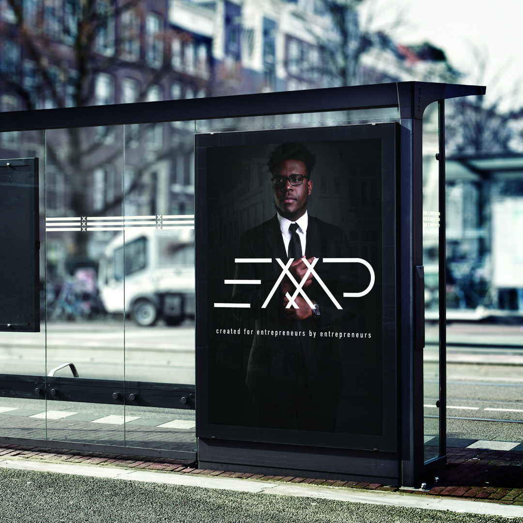
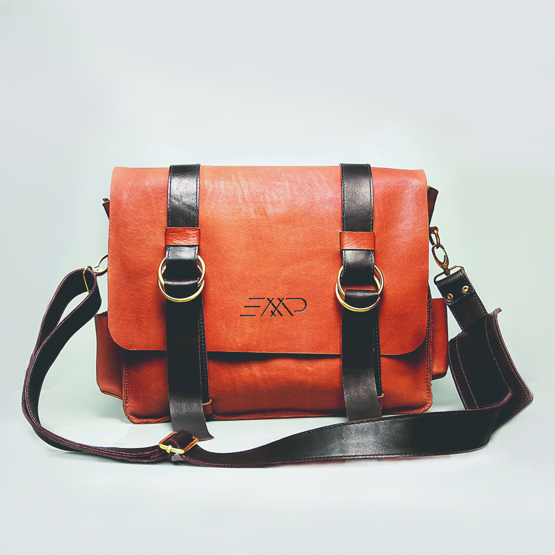
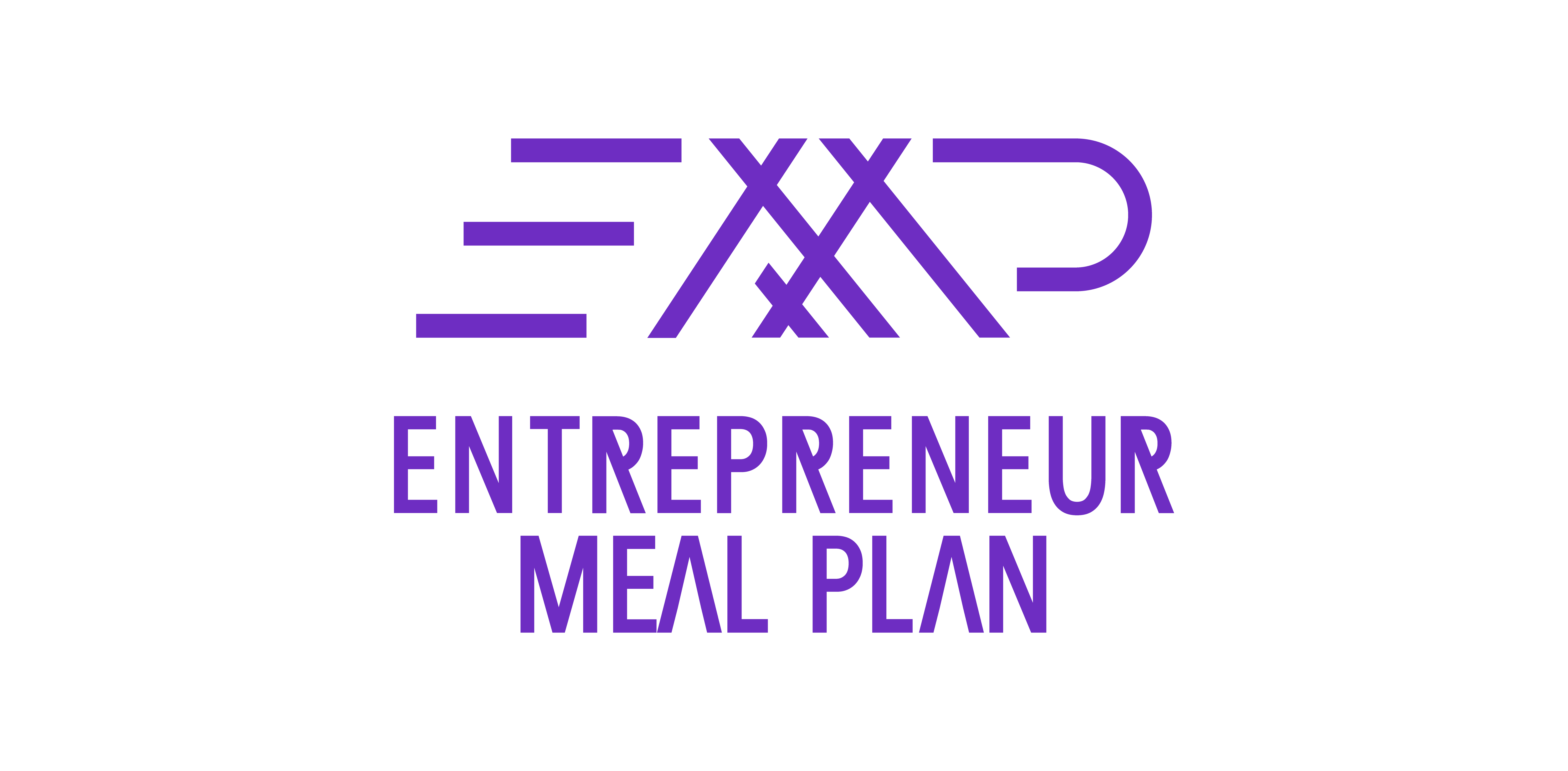
Logomark & Wordmark – Story-driven visual system conveying support, community, and tribe
Patterns & Campaign Assets – Flexible visuals reinforcing the sense of belonging and ritual
Digital Platforms & Social Media – Translating the identity into shareable, recognizable experiences
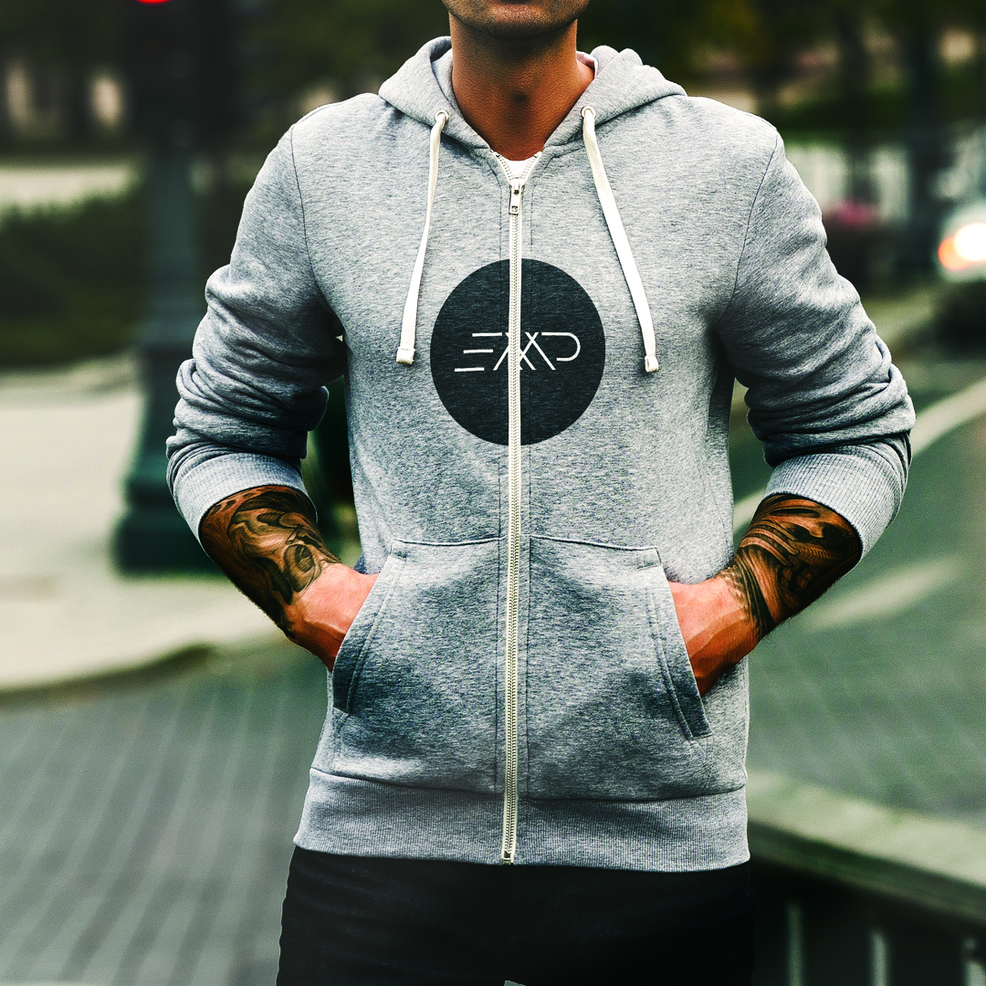
Program Materials – Packaging the tribe’s story into every touchpoint, enhancing perception of professionalism, trust, and cohesion
Every element expresses clarity and purpose — not just design for the sake of design.
ABCDEFGHIJKLMOPQRSTUVWXZ
abcdefghijklmnopqrstuvwxyz
1234567890
Color Palette