Many sports training facilities believe all it takes to stand out is bigger banners, flashier logos, or the newest equipment.
What they’re actually missing is clarity:
clarity of mission, clarity of the people they’re meant to guide, and clarity of the experience they’re offering.
Crawford Crossings was no different.
clarity of mission, clarity of the people they’re meant to guide, and clarity of the experience they’re offering.
Project Overview:
Client: Crawford Crossings
Industry: Sports & Leadership Training
Founders: Cody & Danielle Crawford (15+ years combined professional sports experience)
Core Problem: Establishing differentiation, building trust, and connecting mission to audience
Oathic Focus: Brand clarity → story-led identity → flexible, scalable visual system
Deliverables: Brand strategy, visual identity system, custom logomark, logotype, brand guidelines
Timeline: Collaborative multi-session strategic engagement

The Challenge
Surface symptom:
“We need a brand that feels professional and recognizable — but also warm, welcoming, and distinct in the sports training space.”
Root issue:
Crawford Crossings’ mission — developing leadership and life skills alongside athletic excellence — wasn’t fully reflected in the brand identity. The facility needed to communicate not just skill-building, but trust, mentorship, and a sense of belonging.
Risk if unchanged:
Without clarity, Crawford Crossings risked blending in with other sports facilities, failing to convey the deeper value of their programming, and missing the opportunity to become the go-to hub for families seeking both athletic and personal development.
Crawford Crossings’ mission — developing leadership and life skills alongside athletic excellence — wasn’t fully reflected in the brand identity. The facility needed to communicate not just skill-building, but trust, mentorship, and a sense of belonging.
Without clarity, Crawford Crossings risked blending in with other sports facilities, failing to convey the deeper value of their programming, and missing the opportunity to become the go-to hub for families seeking both athletic and personal development.
Strategic Insight
The breakthrough insight was simple but transformative:
Sports training isn’t just about performance metrics — it’s about growth, milestones, and the feeling of “home.”
Crawford Crossings’ opportunity wasn’t to create just another athletic brand. It was to create an identity that told the story of progress, connection, and community — from first step to home plate, on and off the field.
This insight reframed every design decision: the logo, the mark, the typography — everything became an expression of journey, leadership, and belonging.
The Approach
Oathic’s process centered on clarity, collaboration, and translating essence into design:
Discovery & Strategy Sessions – uncovering mission, audience needs, and key differentiators
Narrative Anchoring – identifying “home” as the brand’s guiding principle, reinforcing safety, growth, and community
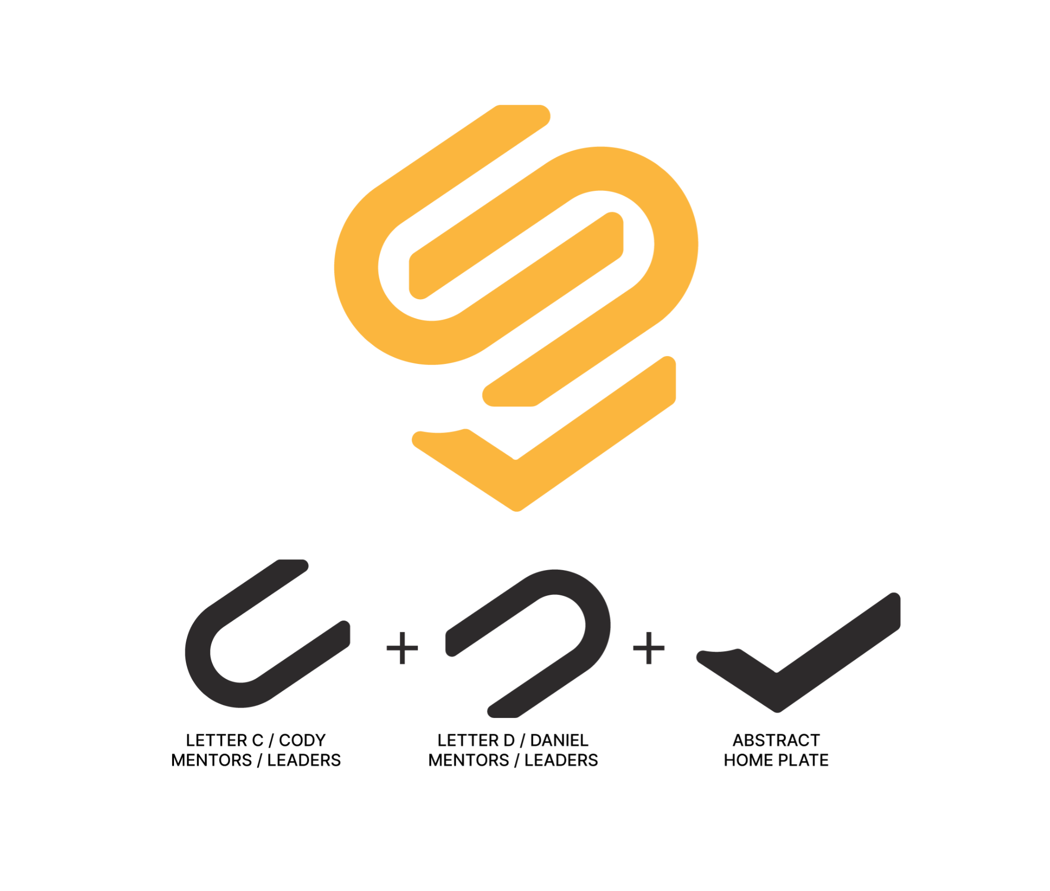
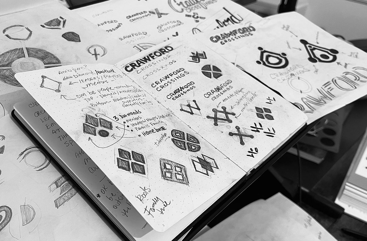
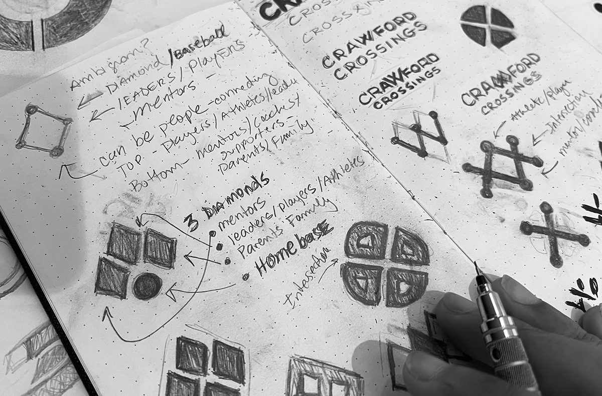
Concept Development – iterating logomark options that reflected milestones, journey, and founder identity (C+D initials)
Visual Translation – ensuring flexibility across digital, print, and physical applications, with a cohesive logotype and scalable mark system
Every step tied back to the strategic insight: identity as a journey, not just a visual.

The Solution
Custom Logomark:
An abstract home plate/base icon representing the journey from first step to home. Incorporated founders’ initials (C+D) to anchor the brand personally. The mark embodies progress, milestones, and community.
Custom Logotype:
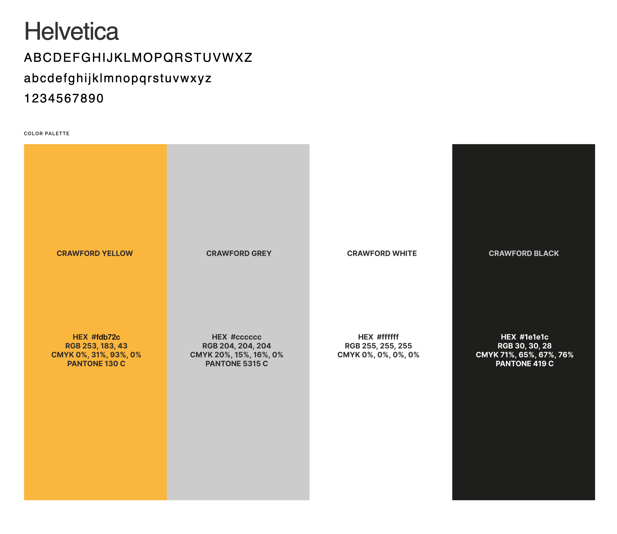
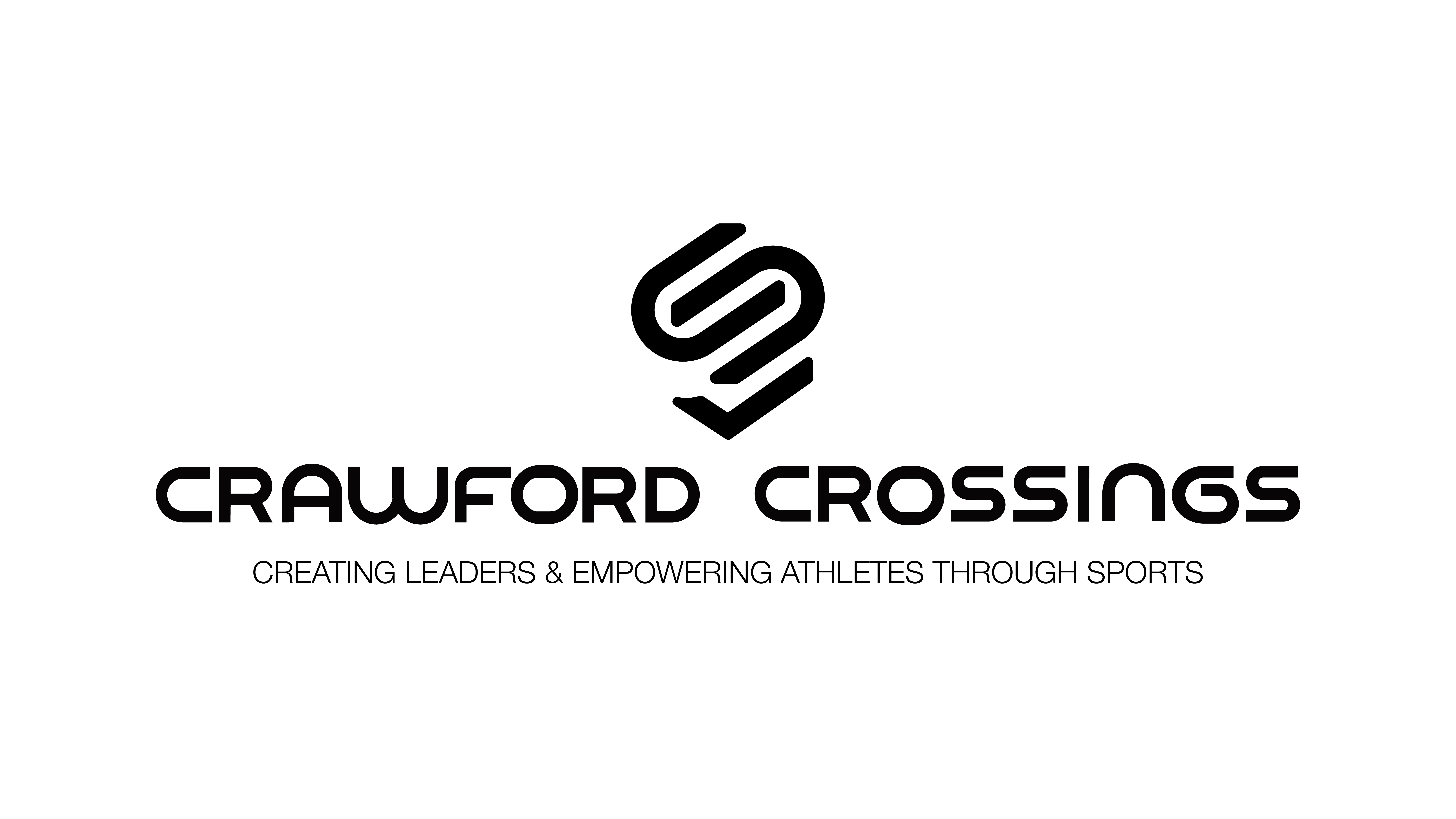
Sleek, modern, flexible typography that complements the mark and extends the brand identity across signage, digital, and print.
Narrative-Driven Design Decisions:
Each visual element reinforces “home” and personal growth
Symbolic storytelling embedded in mark geometry (diamond/base progression)
Scalable system adaptable across platforms, events, and merchandising
Result:
Crawford Crossings gained a brand identity that visually communicates leadership, trust, and belonging — clearly differentiating them in a crowded sports training landscape.
Sleek, modern, flexible typography that complements the mark and extends the brand identity across signage, digital, and print.
Crawford Crossings gained a brand identity that visually communicates leadership, trust, and belonging — clearly differentiating them in a crowded sports training landscape.
The Outcome
The Oathic-designed identity delivered measurable and qualitative impact:
✅ Enhanced Recognition: Clear, memorable identity that immediately communicates trust and professionalism
✅ Aligned Messaging: Visuals reflect the mission to develop leaders on and off the field
✅ Versatile Application: Seamless integration across digital, print, facility signage, and community touch-points
✅ Founder Embodiment: Cody and Danielle can fully own the story of Crawford Crossings — positioning it as a sanctuary for growth, mentorship, and athletic excellence
Brand Expressions Brought to Life
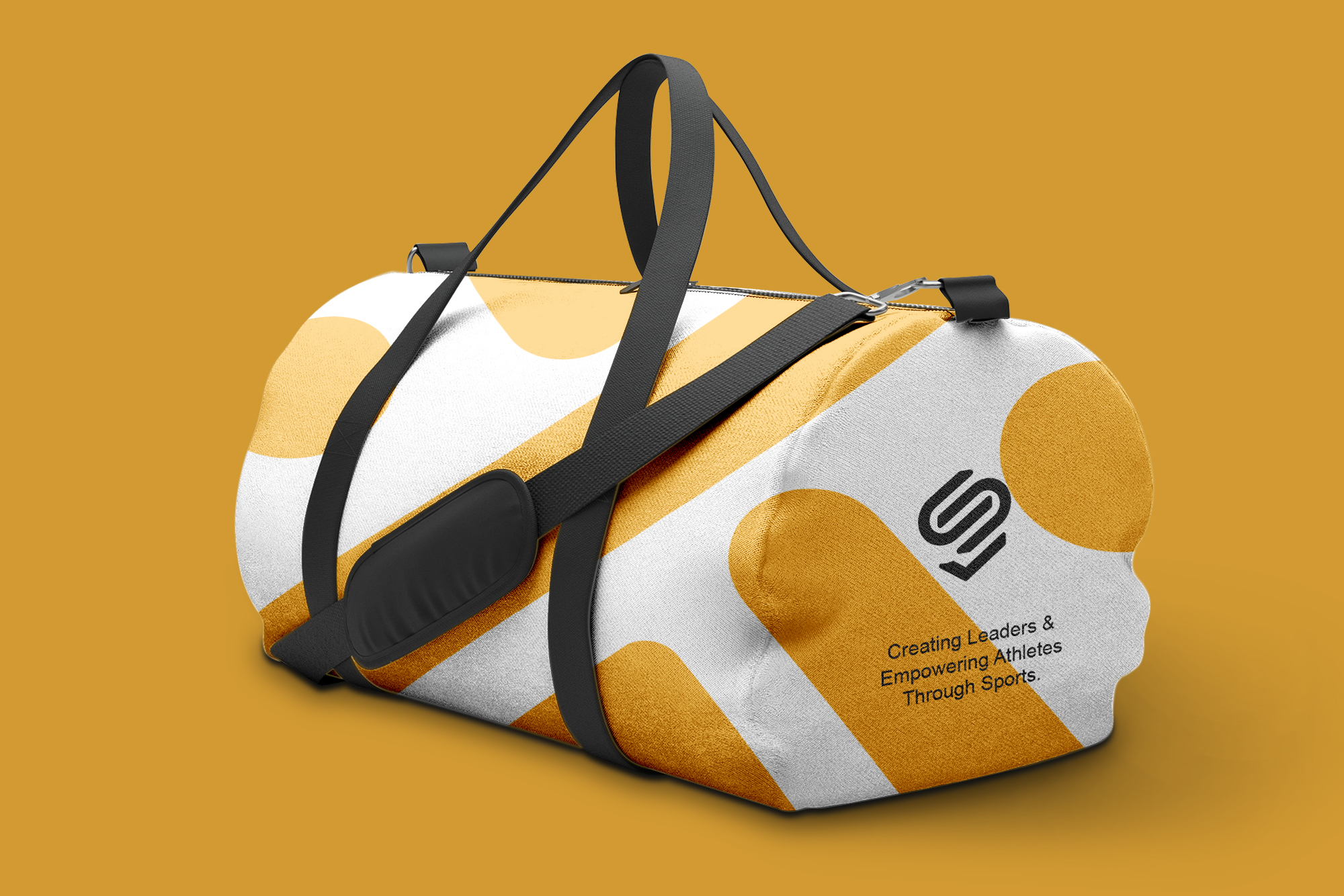
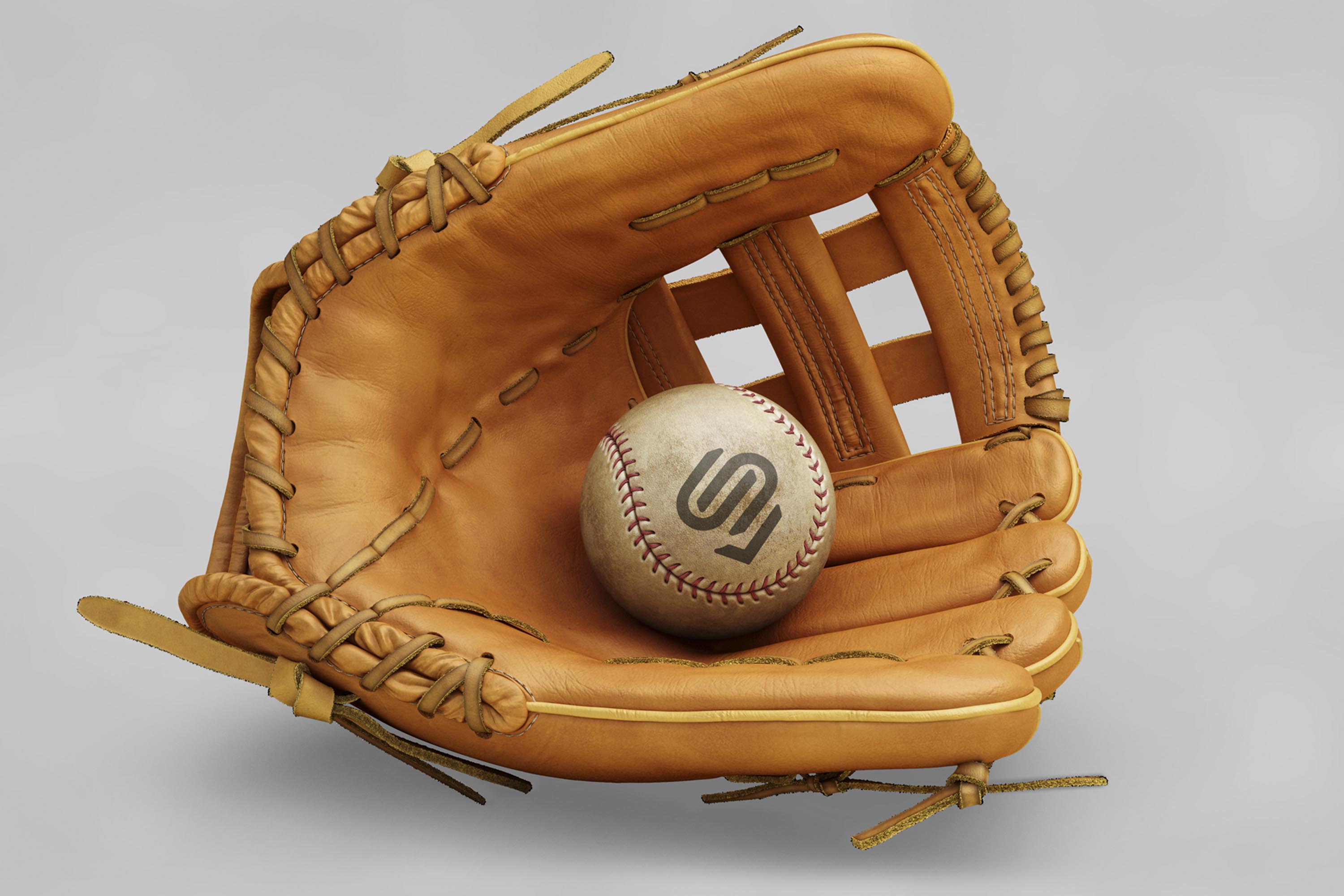
Instead of static logos, Crawford Crossings’ identity comes alive across:
Custom Logomark & Wordmark – embodying progression, milestones, and the founders’ story
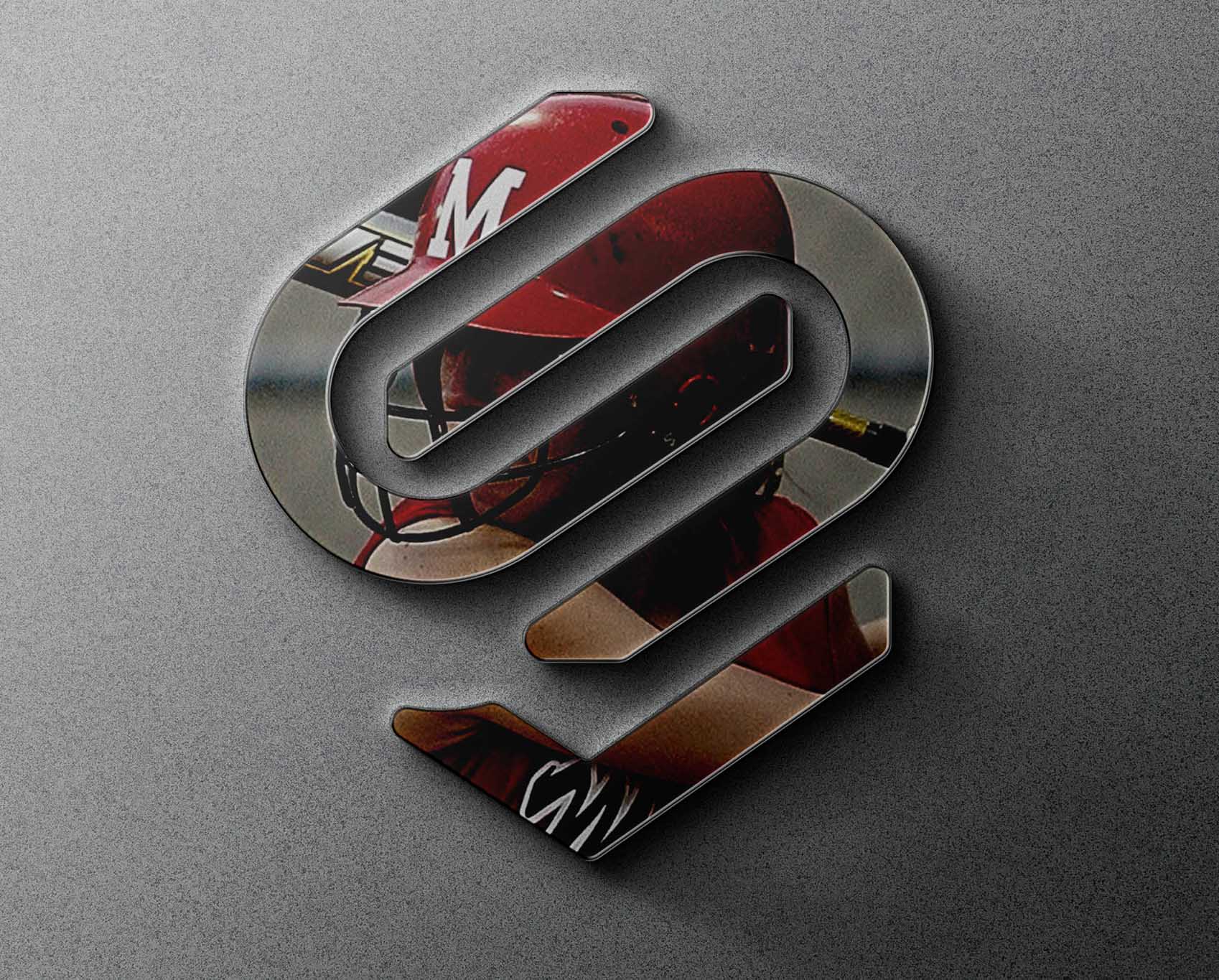
Facility Signage & Merchandise – extending identity into the community experience
Digital & Social Touchpoints – communicating trust, leadership, and mentorship
Narrative Anchored Design– every visual choice reinforces the brand story and audience connection
Every asset is an expression of clarity, not just aesthetics.