When established brands launch something new, the risk isn’t visibility — it’s dilution.
Many founders believe a sub-brand just needs a different look to feel fresh.
What they’re actually navigating is something deeper:
clarity of differentiation, clarity of tone, and clarity of how far they can stretch without breaking trust.
Awkward Therapy was born inside two of the most recognized personal development platforms in the world — and it needed to feel distinct without disconnecting from what millions already trusted.
clarity of differentiation, clarity of tone, and clarity of how far they can stretch without breaking trust.
Project Overview:
Client:
Lewis Howes & Jay Shetty
Primary Platforms:
The School of Greatness & On Purpose
Industry:
Podcast / Personal Development / Media
Audience Reach:
Hundreds of millions of downloads & global listeners
Core Problem:
Launch a distinct sub-brand without diluting two globally established brands
Oathic Focus:
Strategic differentiation → bold identity → scalable digital system
Deliverables:
Custom logotype, disruptive brand mark, scalable icon system
Timeline: 2–3 day strategic turnaround

The Challenge
Surface symptom: “We need something playful and bold — different from our main shows.”
Root issue:
How do you create a sub-brand that explores taboo topics, humor, and vulnerability — without undermining two platforms already cemented as pillars in the personal development space?
Lewis Howes (host of The School of Greatness, 3x New York Times bestselling author) and Jay Shetty (host of the globally renowned On Purpose podcast) had built brands synonymous with inspiration, credibility, and depth.
Awkward Therapy needed to feel:
• Playful
• Slightly disruptive
• Less serious
• Visually differentiated
But still connected to the trust they had spent years building.
Risk if unchanged:
If it felt too similar, it would blend into their existing brands.
If it felt too disconnected, it could fracture trust or confuse their audience.
The margin for error was small — and the timeline was tight.
How do you create a sub-brand that explores taboo topics, humor, and vulnerability — without undermining two platforms already cemented as pillars in the personal development space?
• Slightly disruptive
• Less serious
• Visually differentiated
If it felt too similar, it would blend into their existing brands.
If it felt too disconnected, it could fracture trust or confuse their audience.
Strategic Insight
The opportunity wasn’t to create “another podcast logo.”
It was to visually represent the act of disruption itself.
Awkward Therapy was about breaking conversational norms. Exploring taboo topics. Leaning into discomfort with humor and honesty.
The insight became clear:
The identity itself should feel slightly off — intentionally.
• Not chaotic.
• Not unprofessional.
• But subtly disruptive.
If their core platforms represented structure and grounded wisdom, Awkward Therapy could represent contrast — curiosity, play, and boundary-pushing dialogue.
• Not unprofessional.
• But subtly disruptive.

The Approach
Given the compressed 2–3 day timeline, clarity had to lead immediately.
The process focused on:
1. Strategic Alignment Call.
Clarifying the tonal departure from The School of Greatness and On Purpose — defining how far we could stretch visually while preserving brand equity.
2. Conceptual Exploration
Exploring visual metaphors around “taboo,” disruption, and boundary-breaking — without sacrificing scalability for podcast covers, thumbnails, and mobile icons.
3. Distinctive Anchor Development
Identifying a single, ownable visual move that could carry the brand’s personality across platforms.
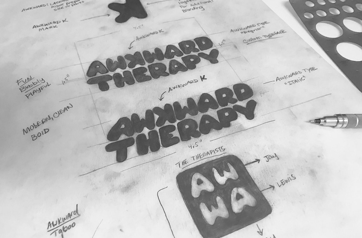
The breakthrough came through typography.
Clarifying the tonal departure from The School of Greatness and On Purpose — defining how far we could stretch visually while preserving brand equity.
Exploring visual metaphors around “taboo,” disruption, and boundary-breaking — without sacrificing scalability for podcast covers, thumbnails, and mobile icons.
Identifying a single, ownable visual move that could carry the brand’s personality across platforms.
The Solution
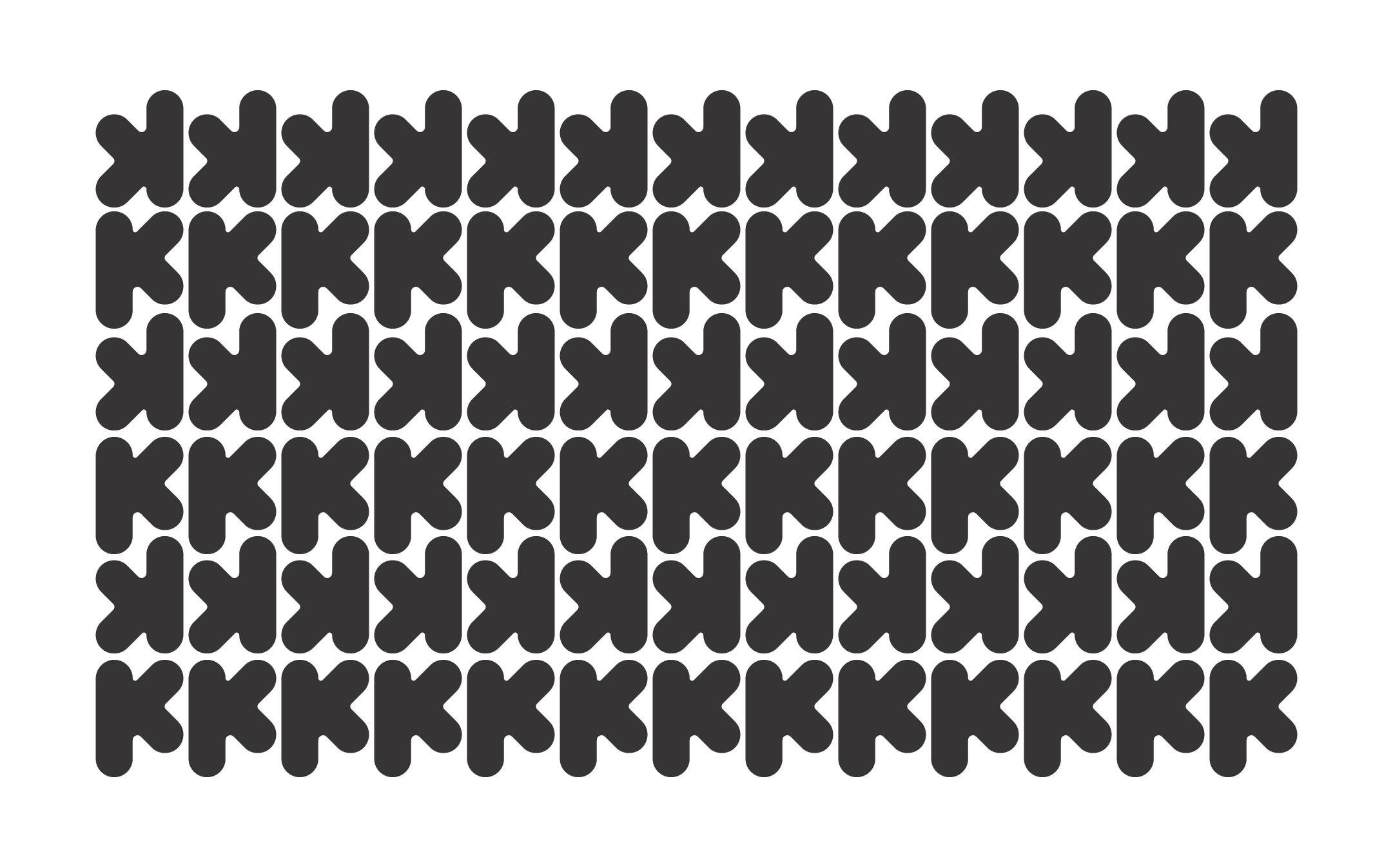
The defining move: reversing the letter “K” in “Awkward.”
This single decision became the brand’s visual metaphor.
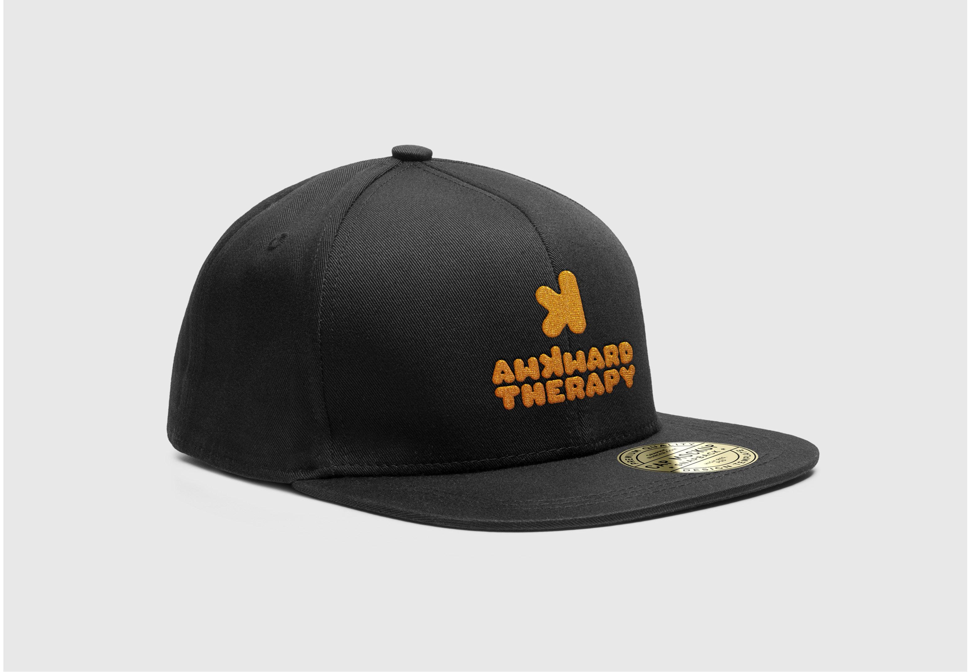
Custom Logotype: A bold, confident wordmark anchored by the flipped “K,” signaling disruption and unconventional dialogue.
Disruptive Mark System: The reversed “K” extracted as a standalone icon — scalable across podcast artwork, thumbnails, and digital platforms.
Playful Character Extensions: Subtle icon variations derived from “AW,” adding personality and range for digital use.
The result was a mark that felt:
Audacious but intelligent
Playful but intentional
Disruptive without being chaotic
It visually embodied the premise of the show: turning uncomfortable conversations into accessible, engaging experiences.
Every design decision reinforced one idea:
This is not your typical therapy conversation.

The Outcome
Even within a 2–3 day development window, the identity delivered:
✅ A bold, instantly recognizable visual anchor
✅ Clear tonal differentiation from two globally established podcast brands
✅ A scalable digital-ready system designed for modern media distribution
Although Lewis and Jay ultimately chose to integrate Awkward Therapy under The School of Greatness brand umbrella rather than launch it as a standalone property, the work stands as proof of:
✅ Strategic clarity under pressure
✅ Creative precision within tight timelines
✅ The ability to protect brand equity while expanding into new territory
Most importantly, it demonstrated the trust placed in Oathic — being personally asked to shape a brand extension connected to platforms reaching hundreds of millions worldwide.
That level of invitation speaks to credibility beyond aesthetics.
✅ Creative precision within tight timelines
✅ The ability to protect brand equity while expanding into new territory
Brand Expressions Brought to Life
The Awkward Therapy identity was designed for digital-first performance:
Custom Wordmark– anchored by the reversed “K”
Standalone Disruptive Icon– scalable for mobile and podcast platforms
Digital Artwork Applications – adaptable across thumbnails, covers, and extensions
Character Variations – playful elements extending the show’s tone
Each expression reinforced the core concept: disruption with intention.

Primary Logomark

Custom Logotype

Typography | Font Direction:
ABCDEFGHIJKLMOPQRSTUVWXZ
abcdefghijklmnopqrstuvwxyz
1234567890
Color Palette


When established brands launch something new, the risk isn’t visibility — it’s dilution.
Many founders believe a sub-brand just needs a different look to feel fresh.
What they’re actually navigating is something deeper:
clarity of differentiation, clarity of tone, and clarity of how far they can stretch without breaking trust.
Awkward Therapy was born inside two of the most recognized personal development platforms in the world — and it needed to feel distinct without disconnecting from what millions already trusted.
clarity of differentiation, clarity of tone, and clarity of how far they can stretch without breaking trust.
Project Overview:
Client:
Lewis Howes & Jay Shetty
Primary Platforms:
The School of Greatness & On Purpose
Industry:
Podcast / Personal Development / Media
Audience Reach:
Hundreds of millions of downloads & global listeners
Core Problem:
Launch a distinct sub-brand without diluting two globally established brands
Oathic Focus:
Strategic differentiation → bold identity → scalable digital system
Deliverables:
Custom logotype, disruptive brand mark, scalable icon system
Timeline: 2–3 day strategic turnaround
The Challenge
Surface symptom: “We need something playful and bold — different from our main shows.”
Root issue:
How do you create a sub-brand that explores taboo topics, humor, and vulnerability — without undermining two platforms already cemented as pillars in the personal development space?
Lewis Howes (host of The School of Greatness, 3x New York Times bestselling author) and Jay Shetty (host of the globally renowned On Purpose podcast) had built brands synonymous with inspiration, credibility, and depth.
Awkward Therapy needed to feel:
• Playful
• Slightly disruptive
• Less serious
• Visually differentiated
But still connected to the trust they had spent years building.
Risk if unchanged:
If it felt too similar, it would blend into their existing brands.
If it felt too disconnected, it could fracture trust or confuse their audience.
The margin for error was small — and the timeline was tight.
How do you create a sub-brand that explores taboo topics, humor, and vulnerability — without undermining two platforms already cemented as pillars in the personal development space?
• Slightly disruptive
• Less serious
• Visually differentiated
If it felt too similar, it would blend into their existing brands.
If it felt too disconnected, it could fracture trust or confuse their audience.
Strategic Insight
The opportunity wasn’t to create “another podcast logo.”
It was to visually represent the act of disruption itself.
Awkward Therapy was about breaking conversational norms. Exploring taboo topics. Leaning into discomfort with humor and honesty.
The insight became clear:
The identity itself should feel slightly off — intentionally.
• Not chaotic.
• Not unprofessional.
• But subtly disruptive.
If their core platforms represented structure and grounded wisdom, Awkward Therapy could represent contrast — curiosity, play, and boundary-pushing dialogue.
• Not unprofessional.
• But subtly disruptive.
The Approach
Given the compressed 2–3 day timeline, clarity had to lead immediately.
The process focused on:
1. Strategic Alignment Call.
Clarifying the tonal departure from The School of Greatness and On Purpose — defining how far we could stretch visually while preserving brand equity.
2. Conceptual Exploration
Exploring visual metaphors around “taboo,” disruption, and boundary-breaking — without sacrificing scalability for podcast covers, thumbnails, and mobile icons.
3. Distinctive Anchor Development
Identifying a single, ownable visual move that could carry the brand’s personality across platforms.
The breakthrough came through typography.
Clarifying the tonal departure from The School of Greatness and On Purpose — defining how far we could stretch visually while preserving brand equity.
Exploring visual metaphors around “taboo,” disruption, and boundary-breaking — without sacrificing scalability for podcast covers, thumbnails, and mobile icons.
Identifying a single, ownable visual move that could carry the brand’s personality across platforms.
The Solution
The defining move: reversing the letter “K” in “Awkward.”
This single decision became the brand’s visual metaphor.
Custom Logotype: A bold, confident wordmark anchored by the flipped “K,” signaling disruption and unconventional dialogue.
Disruptive Mark System: The reversed “K” extracted as a standalone icon — scalable across podcast artwork, thumbnails, and digital platforms.
Playful Character Extensions: Subtle icon variations derived from “AW,” adding personality and range for digital use.
The result was a mark that felt:
• Audacious but intelligent
• Playful but intentional
• Disruptive without being chaotic
It visually embodied the premise of the show: turning uncomfortable conversations into accessible, engaging experiences.
Every design decision reinforced one idea:
This is not your typical therapy conversation.
• Playful but intentional
• Disruptive without being chaotic
The Outcome
Even within a 2–3 day development window, the identity delivered:
✅ A bold, instantly recognizable visual anchor
✅ Clear tonal differentiation from two globally established podcast brands
✅ A scalable digital-ready system designed for modern media distribution
Although Lewis and Jay ultimately chose to integrate Awkward Therapy under The School of Greatness brand umbrella rather than launch it as a standalone property, the work stands as proof of:
✅ Strategic clarity under pressure
✅ Creative precision within tight timelines
✅ The ability to protect brand equity while expanding into new territory
Most importantly, it demonstrated the trust placed in Oathic — being personally asked to shape a brand extension connected to platforms reaching hundreds of millions worldwide.
That level of invitation speaks to credibility beyond aesthetics.
✅ Creative precision within tight timelines
✅ The ability to protect brand equity while expanding into new territory
Brand Expressions Brought to Life
The Awkward Therapy identity was designed for digital-first performance:
Custom Wordmark– anchored by the reversed “K”
Standalone Disruptive Icon– scalable for mobile and podcast platforms
Digital Artwork Applications – adaptable across thumbnails, covers, and extensions
Character Variations – playful elements extending the show’s tone
Each expression reinforced the core concept: disruption with intention.
Primary Logomark
Custom Logotype
Typography | Font Direction:
ABCDEFGHIJKL
MOPQRSTUVWXZ
abcdefghijklmn
opqrstuvwxyz
1234567890
Color Palette