Most wellness brands think their challenge is “looking healthy and vibrant.”
What they’re really missing is clarity: clarity of purpose, clarity of audience, and clarity of the experience they’re meant to create.
Plant Candy wasn’t just a brand — it was an experience waiting to be expressed.
Project Overview:
Client: Plant Candy
Industry: Plant-Based Health & Wellness
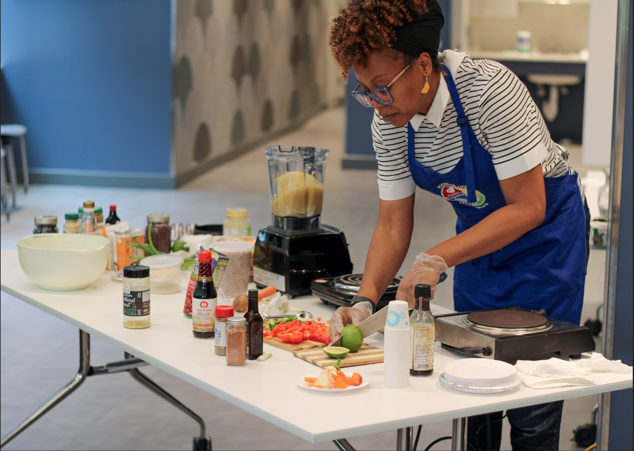
Founder: NYC-based wellness entrepreneur
Core Problem: Brand misalignment + crowded, competitive market
Oathic Focus: Brand clarity → story-led identity → adaptable visual system
Deliverables: Discovery & strategy sessions, brand strategy, visual identity system, logomark & wordmark
The Challenge
Surface symptom: “I need my brand to look modern and stand out in the wellness space.”
Root issue: Plant Candy’s mission — creating joy, community, and healthy experiences — wasn’t fully expressed visually or verbally. The brand identity did not capture the vitality, inclusivity, and educational energy central to the experience they provide.
Risk if unchanged: The brand would remain lost in a saturated market, potentially being perceived as just another plant-based product line, rather than a vibrant, community-centered wellness experience.
Strategic Insight
Wellness isn’t just what you eat — it’s the energy, growth, and community you cultivate around it.
Plant Candy’s opportunity was not to create a “prettier” logo or trendier packaging. It was to translate their playful, educational, and growth-oriented personality into every visual touchpoint, so the brand could be experienced, not just seen.
This insight reframed the work: design would communicate story, purpose, and audience connection, not just aesthetic appeal.
The Approach
Oathic’s method is simple, repeatable, and intentional:
Discovery & Strategy Sessions – uncovering mission, audience expectations, and internal differentiators
Creative Exploration – iterating visual concepts to balance flexibility, boldness, and narrative-driven storytelling
Design Translation – letting clarity guide the identity, from monogram composition to wordmark cohesion, ensuring the brand is adaptable across multiple applications
Every step prioritized alignment with Plant Candy’s mission and audience experience, rather than trends or visual preferences alone.

The Solution
Each design decision was rooted in clarity and story:
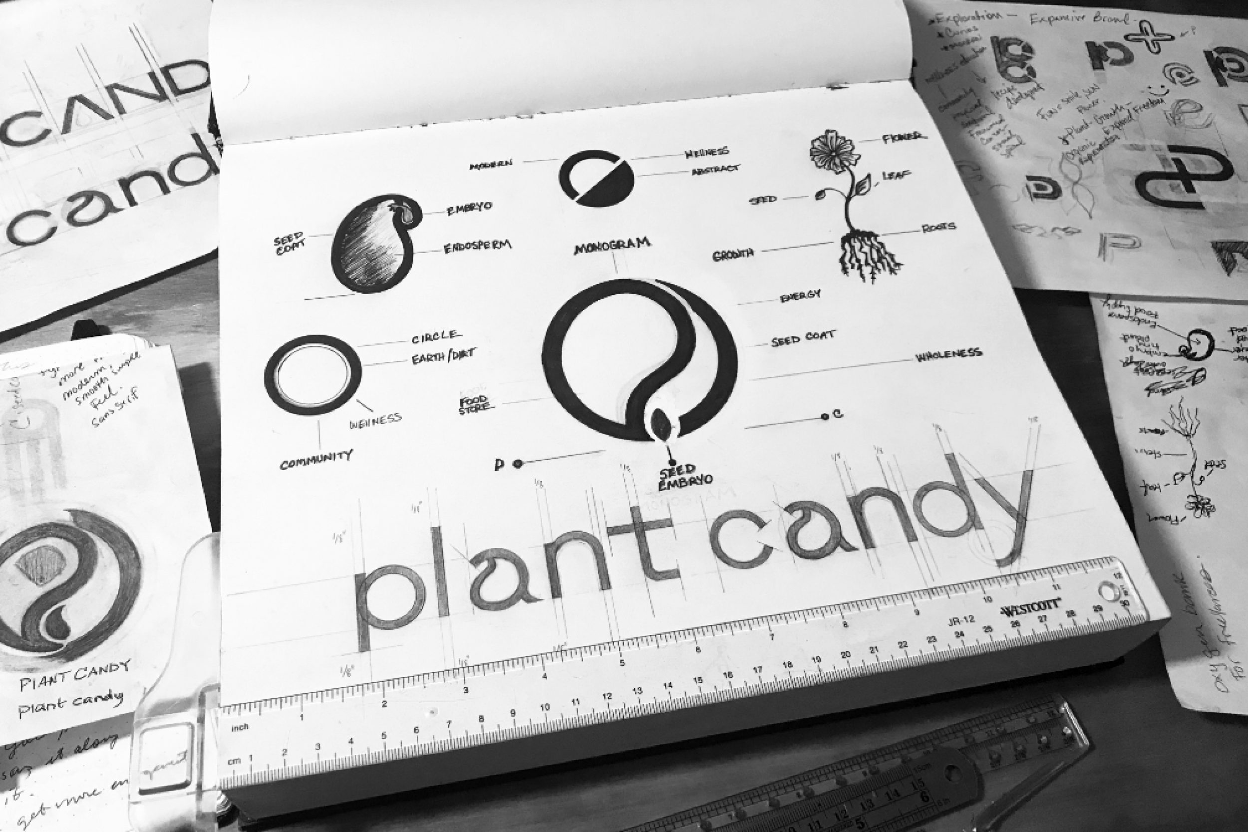
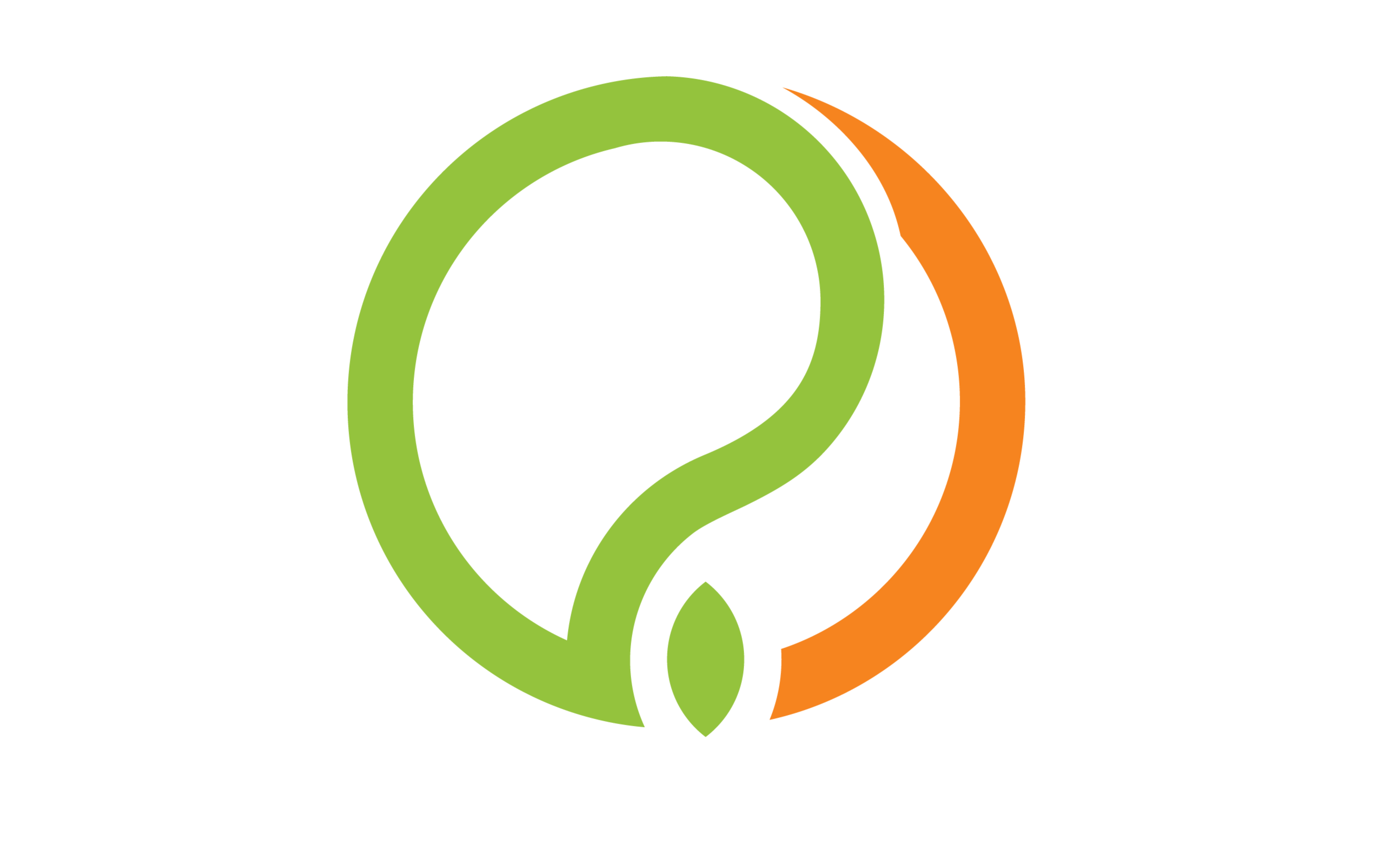
Abstract Monogram (“P&C”) – symbolizes a seed’s growth process.
“P” represents the nutrient store and protective coat.
“C” completes the protective coat and shows the plant’s growth path via negative space.
Circular composition embodies Earth, wholeness, wellness, and community.
Seed Icon – central to the monogram, representing growth, vitality, and completion.
Wordmark – sleek, modern, and cohesive with the logomark, with subtle nods to the monogram shapes for consistency.
This identity communicates Plant Candy’s playful, educational, and wellness-oriented personality while remaining flexible, contemporary, and scalable across all brand touchpoints.
The Outcome
The Oathic-designed identity enabled Plant Candy to:
✅ Launch a distinctive and adaptable visual system that communicates growth, wellness, and community.
✅ Strengthen audience connection through story-driven visuals that translate their mission into experience.
✅ Confidently apply the brand across packaging, social, and digital marketing, reducing decision fatigue and ensuring consistency.
✅ Position Plant Candy as a recognizable leader in the plant-based wellness space, communicating joy, accessibility, and expertise.
Brand Expressions Brought to Life
Instead of static logos, the Plant Candy identity comes alive across:
Logomark & Wordmark – integrated, story-driven visual system
Seed Icon & Monogram – symbolizing growth, vitality, and wholeness
Packaging & Marketing Materials – clear, flexible, and adaptable
Digital & Social Touchpoints – bringing personality and community to life visually
Every asset is an expression of clarity and mission, not just a design.

Primary Logomark
Custom Wordmark


Typography | Font Direction:
ABCDEFGHIJKLMOPQRSTUVWXZ
abcdefghijklmnopqrstuvwxyz
1234567890
Color Palette


Most wellness brands think their challenge is “looking healthy and vibrant.”
What they’re really missing is clarity: clarity of purpose, clarity of audience, and clarity of the experience they’re meant to create.
Plant Candy wasn’t just a brand — it was an experience waiting to be expressed.
Project Overview:
Client: Plant Candy
Industry: Plant-Based Health & Wellness
Founder: NYC-based wellness entrepreneur
Core Problem: Brand misalignment + crowded, competitive market
Oathic Focus: Brand clarity → story-led identity → adaptable visual system
Deliverables: Discovery & strategy sessions, brand strategy, visual identity system, logomark & wordmark
The Challenge
Surface symptom: “I need my brand to look modern and stand out in the wellness space.”
Root issue: Plant Candy’s mission — creating joy, community, and healthy experiences — wasn’t fully expressed visually or verbally. The brand identity did not capture the vitality, inclusivity, and educational energy central to the experience they provide.
Risk if unchanged: The brand would remain lost in a saturated market, potentially being perceived as just another plant-based product line, rather than a vibrant, community-centered wellness experience.
Strategic Insight
Wellness isn’t just what you eat — it’s the energy, growth, and community you cultivate around it.
Plant Candy’s opportunity was not to create a “prettier” logo or trendier packaging. It was to translate their playful, educational, and growth-oriented personality into every visual touchpoint, so the brand could be experienced, not just seen.
This insight reframed the work: design would communicate story, purpose, and audience connection, not just aesthetic appeal.
The Approach
Oathic’s method is simple, repeatable, and intentional:
Discovery & Strategy Sessions – uncovering mission, audience expectations, and internal differentiators
Creative Exploration – iterating visual concepts to balance flexibility, boldness, and narrative-driven storytelling
Design Translation – letting clarity guide the identity, from monogram composition to wordmark cohesion, ensuring the brand is adaptable across multiple applications
Every step prioritized alignment with Plant Candy’s mission and audience experience, rather than trends or visual preferences alone.
The Solution
Each design decision was rooted in clarity and story:
Abstract Monogram (“P&C”) – symbolizes a seed’s growth process.
“P” represents the nutrient store and protective coat.
“C” completes the protective coat and shows the plant’s growth path via negative space.
Circular composition embodies Earth, wholeness, wellness, and community.
Seed Icon – central to the monogram, representing growth, vitality, and completion.
Wordmark – sleek, modern, and cohesive with the logomark, with subtle nods to the monogram shapes for consistency.
This identity communicates Plant Candy’s playful, educational, and wellness-oriented personality while remaining flexible, contemporary, and scalable across all brand touchpoints.
The Outcome
The Oathic-designed identity enabled Plant Candy to:
✅ Launch a distinctive and adaptable visual system that communicates growth, wellness, and community.
✅ Strengthen audience connection through story-driven visuals that translate their mission into experience.
✅ Confidently apply the brand across packaging, social, and digital marketing, reducing decision fatigue and ensuring consistency.
✅ Position Plant Candy as a recognizable leader in the plant-based wellness space, communicating joy, accessibility, and expertise.
Brand Expressions Brought to Life
Instead of static logos, the Plant Candy identity comes alive across:
Logomark & Wordmark – integrated, story-driven visual system
Seed Icon & Monogram – symbolizing growth, vitality, and wholeness
Packaging & Marketing Materials – clear, flexible, and adaptable
Digital & Social Touchpoints – bringing personality and community to life visually
Every asset is an expression of clarity and mission, not just a design.
Primary Logomark
Custom Wordmark
Typography | Font Direction:
ABCDEFGHIJKLMOPQRSTUVWXZ
abcdefghijklmnopqrstuvwxyz
1234567890
Color Palette